Unpacking Key Design System Principles
Discover the core design system principles that create consistency, efficiency, and scale. Learn to build better products with a strong design foundation.
 FekriJune 25, 20253 min read
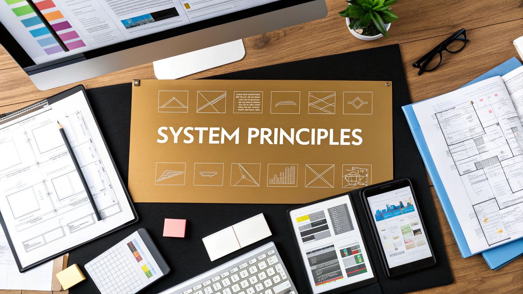
Design system principles are the high-level, foundational rules that guide how a product is built and how it evolves over time. Think of them as a constitution for your team, making sure every button, layout, and interaction is cohesive, intentional, and perfectly aligned with your core product vision.
Why Design System Principles Are Your Product's DNA
Imagine trying to build a city without a blueprint. No zoning laws, no shared architectural style. One neighborhood might end up with wide, modern avenues while another has narrow, cobblestone streets. The result? A chaotic, inefficient, and confusing place to navigate. This is exactly what happens when a digital product is built without a strong foundation.
Design system principles are the blueprint and the laws for your product's city. They aren't just vague suggestions; they're the enforceable rules that dictate how your product looks, feels, and behaves. These principles forge a shared language that unites everyone—from engineering and product management to marketing and support—around a common goal.
When a designer proposes a new feature, they check it against the principles. When a developer builds a component, they make sure it follows the established rules. This alignment is crucial for preventing design debt, where small, seemingly harmless inconsistencies pile up over time, creating a product that feels disjointed and becomes expensive to maintain.
The Business Case for Solid Principles
Getting this foundation right is about more than just making things look nice. It has a real, tangible business impact. A consistent user experience across every touchpoint isn't optional anymore; it's what builds user trust and loyalty. When people encounter predictability, they feel more confident and in control.
A design system isn't merely a library of UI components. It's an operational model that translates a company's core values and brand identity into a scalable, repeatable process for building high-quality digital experiences.
This structured approach is clearly catching on. Recent data shows a massive shift towards design systems, with 58% of companies now using internal systems, a number second only to the adoption of Google's Material Design. This trend highlights a growing understanding that consistency and efficiency are critical for modern product development. You can dive deeper into this shift in the latest design system report.
From Abstract Rules to Practical Application
The true power of design system principles comes alive when they are actionable and clear. For a product to truly connect with users and maintain a strong identity, a solid grounding in fundamental UI/UX design principles is non-negotiable. These principles connect high-level strategy to the everyday decisions that shape your user interface.
Here’s how abstract principles translate into real-world outcomes:
- Principle: "Clarity Above All." This simple rule means every component and interaction must be intuitive. It guides teams to choose clear labels over clever icons and simple navigation over complex, nested menus.
- Principle: "Efficient and Reusable." This principle ensures every new element is built to be modular, just like a LEGO brick. It stops teams from creating one-off solutions, saving countless development hours and making future updates a breeze.
- Principle: "Accessible by Default." This embeds inclusivity directly into the development process. It forces teams to consider color contrast, keyboard navigation, and screen reader compatibility from the very start, not as a last-minute fix.
These principles provide a framework that not only improves the final product but also makes the process of building it more streamlined and collaborative.
The table below summarizes the practical value these principles bring to the table for both the teams building the product and the business itself.
The Core Value Of Key Design System Principles
| Principle Category | Core Value Delivered | Primary Beneficiary |
|---|---|---|
| Consistency & Cohesion | Creates a predictable and trustworthy user experience across the entire product ecosystem. | Users & Brand |
| Efficiency & Scalability | Reduces redundant work and accelerates the design and development lifecycle. | Design & Engineering Teams |
| Clarity & Usability | Ensures the product is intuitive and easy to navigate, lowering cognitive load for users. | Users |
| Accessibility & Inclusivity | Guarantees the product is usable by the widest possible audience, regardless of ability. | All Users & Business (Compliance) |
| Brand Alignment | Translates abstract brand values into a tangible, interactive experience. | Brand & Marketing Teams |
Ultimately, well-defined principles act as a compass, ensuring that even as a product grows and new team members join, every decision is guided by a shared, unwavering vision.
The Foundational Principle of Clarity

Of all the principles that make a design system successful, clarity is the most crucial. It's the bedrock. Without it, even the most beautiful or technically sophisticated system will ultimately cause more problems than it solves. True clarity isn't just about a clean interface; it's about whether the people building your products can intuitively understand every part of the system.
Imagine your design system is a professional workshop. In a clear, well-run shop, every tool is labeled and stored in its proper place. A craftsperson can walk in, instantly grab the exact tool they need, and get to work. But in a messy workshop, tools are scattered everywhere. The same craftsperson now wastes valuable time just hunting for a screwdriver, might grab the wrong one in frustration, and feels defeated before even starting.
A design system that lacks clarity creates that same kind of friction for your teams. This confusion leads to designers misusing components, developers applying styles inconsistently, and countless hours being burned just trying to figure out how things are meant to work together.
Clarity Starts with Great Documentation
The first step to achieving clarity is through unambiguous documentation. This isn't just a "nice-to-have" or some tedious task to check off a list. Your documentation is the official user manual for your product’s entire visual and interactive language. Every component, token, and guideline has to be explained in plain English that everyone—from designers to engineers to product managers—can understand.
For any given component, your documentation should be a practical guide that answers a few simple questions:
- What is this thing? Give it a simple, one-sentence description.
- When do I use it? Provide clear examples of the right scenarios. For instance, you’d use a
Modalfor a critical user action but aPopoverfor displaying extra, non-critical info. - When shouldn't I use it? This is just as important. Outlining the anti-patterns stops people from trying to force a component into the wrong context.
By doing this, you turn documentation from a dusty old reference book into a genuinely helpful tool that bakes clarity right into your team's daily workflow.
Names Matter More Than You Think
The next pillar of clarity is a logical and predictable naming convention. If a component is called box-component-final-v2, it tells you absolutely nothing about what it does. Vague names force your team to guess, and guessing always leads to mistakes.
This is where a structured methodology like Block, Element, Modifier (BEM) really shines. BEM helps you create names that are instantly understandable and self-documenting.
A naming convention like BEM isn't just for developers; it's a communication tool. When a designer asks for a
card--featuredvariant, the developer knows exactly what to build. This shared vocabulary is the hallmark of a truly clear and efficient design system.
Let's look at a simple card component. With BEM, its structure becomes obvious:
.card(The Block): The standalone, parent component..card__title(The Element): A piece of the card, like the title, that can't exist on its own..card--featured(The Modifier): A specific style or state of the card, like a highlighted version.
A system like this removes all the guesswork. The name itself communicates the component’s structure and purpose, making your codebase cleaner and your team more aligned.
Build Intuitive Component APIs
Finally, clarity has to extend all the way down to the code itself, specifically the component’s Application Programming Interface (API). A component's API is just the set of properties (or "props") a developer uses to make it work. An intuitive API makes components easy to use correctly and, just as importantly, hard to use incorrectly.
For example, a button component might have a boolean prop called isDestructive. When a developer sets that to true, the button automatically turns red and adopts the correct styling for a dangerous action like "Delete Account." This is so much clearer than forcing the developer to remember to set color="red" and style="warning", which leaves room for error.
A clear API should offer sensible defaults, use straightforward prop names, and make sure the most common tasks require the least amount of effort. By embedding the system's rules directly into the components themselves, you make doing the right thing the easiest thing to do.
Achieving Rock Solid Product Consistency

Consistency is what separates a polished, trustworthy product from a jumble of disconnected screens. It’s the invisible thread that reassures users they’re in the right place, navigating a single, cohesive world rather than a patchwork of different ideas.
Think about your favorite global coffee chain. Whether you’re in London or Lisbon, you know what to expect. That feeling of familiarity and predictability? That’s the power of consistency, and it’s one of the most important design system principles for building user trust.
When a product feels consistent, users don't have to constantly second-guess themselves or relearn how things work from one feature to the next. This stability reduces their mental effort, builds confidence, and makes your entire product feel professional and reliable.
The Three Layers of Product Consistency
To really nail this, you have to think beyond just matching colors. True consistency is built in layers, with each one supporting the next to create a seamless user journey.
-
Visual Consistency: This is the most obvious layer—what your users see. It’s about the disciplined use of your color palette, typography, spacing, and icons. It’s the simple guarantee that a primary button looks and feels like a primary button, no matter where it appears.
-
Functional Consistency: This layer is all about behavior. If a dropdown menu animates open in a certain way on the settings page, it should behave the exact same way on the user dashboard. Functional consistency ensures that identical parts always act in a predictable manner, so users are never caught off guard.
-
Experiential Consistency: This is the highest and most holistic level. It covers the overall tone, language, and logic of your product. Does your app speak in a friendly, helpful voice or a direct, formal one? Are core workflows, like saving progress or canceling an action, handled in a uniform way across the board?
Shopify's Polaris design system is a masterclass in all three. Its components are visually aligned and functionally predictable, all of which ladder up to a unified experience that makes the complex world of e-commerce feel manageable.
Consistency isn’t about making everything identical. It’s about creating a familiar framework that helps users feel confident and in control. It makes the interface predictable, so they can focus on their tasks, not on figuring out your UI.
Setting up clear visual guidelines is the first step. Resources like these Notion Brand Guideline templates show how you can standardize foundational assets, which is the bedrock of a reliable user experience.
Design Tokens: The Engine of Consistency
So, how do you actually enforce these standards across a massive product without losing your mind? The secret weapon is design tokens.
Think of design tokens as the single source of truth for every visual style in your system. They are small, named pieces of data that store your design attributes. Instead of a developer hard-coding a hex code like #3B82F6 into the stylesheet, they use a token like color-brand-primary.
This small shift is a game-changer.
Need to update your primary brand color? You just change the value of that one token. The update then automatically cascades across every single component on every platform—web, iOS, and Android—that references it. This is how you make consistency scalable and effortless.
The results of this structured approach are staggering. One study revealed that teams using a design system were 34 times more likely to achieve their project goals than those going without one. That statistic isn't just a number; it’s a powerful testament to how formalizing your design principles directly contributes to success, from smoother team collaboration to a far better end product. This is why more and more companies are finally investing in dedicated teams to build and maintain these crucial systems.
Building for Scale with Modularity
How do you build a product that can grow and change without shattering into a million pieces? The secret isn't about working harder; it's about working smarter. The solution is one of the most powerful design system principles: modularity. It’s the architectural approach that allows products to scale gracefully from a simple prototype to a complex digital ecosystem.
Think of it like building with LEGO bricks. You don't start by carving a huge, monolithic castle from a single block of plastic. Instead, you have a whole collection of small, standard, and reusable bricks. Each brick is simple on its own, but they're all designed to snap together in predictable ways, letting you build just about anything you can imagine.
This is the very essence of modularity in a design system. You break down your user interface into its smallest, most basic pieces. This way, you can update a single component—your foundational LEGO brick—and that change instantly ripples through every single place it's used. This saves an unbelievable amount of time and keeps your product consistent as it scales.
Deconstructing Interfaces with Atomic Design
A really popular and effective way to wrap your head around modularity is through the lens of Atomic Design, a methodology created by Brad Frost. It gives you a clear mental model for building UIs by breaking them down into a simple, logical hierarchy. Each level builds on the last, moving from the abstract to the concrete.
- Atoms: These are the absolute basics of your UI—the smallest possible building blocks that can't be broken down any further. Think of things like labels, input fields, and buttons. They aren't much use on their own, but they are the foundation for everything else.
- Molecules: These are simple groups of atoms bonded together to do a specific job. For example, combine a label, an input, and a button, and you have a search form molecule. Now that's a real, tangible component you can use again and again.
- Organisms: These are more complex UI sections made up of groups of molecules and atoms. A page header, for instance, could be an organism that combines a logo (atom), a primary navigation (molecule), and that search form (molecule) we just built.
This hierarchy is a fantastic way to see how small, independent parts come together to create complex, fully functional interfaces.
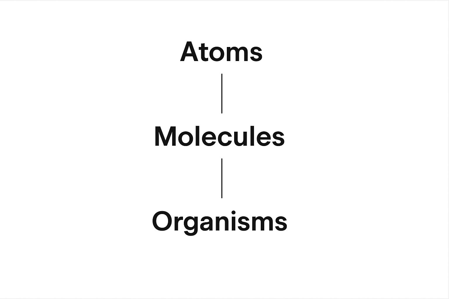
The diagram here visualizes that Atomic Design structure, showing how simple atoms combine to form molecules, which in turn assemble into more complex organisms. This bottom-up approach is what makes a scalable and maintainable front-end architecture possible.
Composition Over Configuration
To make this modular approach truly fly, you have to adopt a "composition over configuration" mindset. In plain English, this means you should favor building complex components by combining simpler ones, rather than creating one monstrous component with dozens of settings.
A component with too many options and switches becomes brittle and a nightmare to understand. When a developer has to dig through 25 different properties just to make a card component look right, the system has failed them.
By focusing on composition, you create a system that is flexible and intuitive. Instead of a single "super-component," you provide a toolbox of simple, focused parts that developers can easily combine to solve unique problems without breaking the system's rules.
This idea of breaking down big things into independent, reusable parts isn't just for the front-end. You’ll find the same thinking in backend architecture; our guide on microservices design principles explores similar concepts for building scalable server-side systems.
Designing for Reusability
Creating components that are genuinely reusable takes foresight. A button isn't just a button; it’s a system. To get the most mileage out of it, you have to detach it from any specific context.
For instance, a button component shouldn't have the text "Submit Order" hard-coded into it. Instead, it should accept that text as a property. This lets it display "Submit Order," "Save Draft," or "Learn More" depending on where it's needed. By keeping components generic, you empower your team to use them in all kinds of situations without having to create new, one-off versions.
For a deeper dive on this, especially when dealing with content that needs to change, it's worth mastering dynamic content strategies.
Ultimately, building with modularity is an investment in your product's future. You're establishing an organized, predictable, and scalable foundation that helps your team build better products faster, no matter how big or complex your application gets.
Boosting Team Efficiency and Velocity
While it’s easy to talk about principles like clarity and modularity, what they're really for is making your teams faster and more effective. A solid design system acts as a force multiplier, turning those abstract rules into real-world speed. It fundamentally changes the day-to-day work by getting rid of the constant friction and guesswork that used to slow everyone down.
Think about a project before a design system. A designer could easily spend days, maybe even a week, designing a new user profile page from scratch. They'd have to figure out the colors, define the spacing, style the buttons, and then painstakingly document it all for a developer. The developer then has to take that static spec and translate it into code, which almost always leads to small misinterpretations, a back-and-forth QA cycle, and frustrating fixes.
Now, imagine that same task with a mature design system in place. The designer isn't inventing a profile page. They’re assembling it, probably in a fraction of the time, using pre-built, pre-approved components like Avatar, InfoCard, and Button. This frees them up to focus their brainpower on the bigger question: what information actually matters most to the user?
Accelerating Design and Development Workflows
When the design gets handed off, it’s already speaking the developer’s language. They aren't coding from pixel-perfect mocks; they're pulling battle-tested React or Vue components straight from the system's library. The entire workflow shifts from manual creation to smart composition.
This change is a game-changer for everyone involved:
- For Designers: Time shifts from redundant pixel-pushing to high-impact user experience strategy. They can prototype and test ideas much faster because the Lego bricks are already there.
- For Developers: Build times get slashed. By using established components, the risk of shipping new bugs plummets, and they spend way less time chasing down those annoying cross-browser visual glitches.
The true test of a design system isn't just how pretty its component library is. It's how much time it gives back to your team. Efficiency isn't about working faster; it's about removing roadblocks so smart people can solve real problems.
This kind of acceleration is critical. In fact, a 2021 study on developer velocity identified top-tier tools as a key driver of performance and business success. You can see how this fits into the bigger picture in our guide to developer productivity tools.
The Hidden Superpower: Onboarding
One of the most powerful—and often overlooked—benefits of a principled design system is how it transforms onboarding. Without one, a new designer or developer can take months to absorb all the unwritten rules, visual nuances, and coding conventions. They learn through a slow, painful process of trial, error, and bugging senior team members for help.
A design system flips that script entirely. It becomes the single source of truth, an interactive, living guide that teaches new hires how to build things the "right way" from their very first day.
Instead of asking a teammate for the hex code for a warning message, they just look up the color-feedback-warning token. Instead of guessing how to build a complex data table, they grab the DataTable component and check its usage examples.
This structured environment radically shortens the ramp-up period. New hires can start contributing meaningful work in days, not months, because the system gives them the guardrails they need to build with confidence. It's a massive efficiency win that pays you back every single time your team grows.
Balancing Robustness with Flexibility

When teams first hear about design systems, a common fear pops up: Will this become a creative prison? A rigid rulebook that just stifles innovation? On the flip side, a system that’s too loose is just as bad. It quickly unravels into the very chaos it was meant to solve.
The best design system principles strike a delicate balance. They aren't just about enforcing rules; they're about guiding teams toward a sweet spot between being solid and being adaptable.
Think of it like a city's building code. The code makes sure every building is safe and structurally sound (that's robustness). But it doesn't demand every single building be an identical gray box. Architects still have plenty of room to create something unique and beautiful within those well-defined boundaries (that's flexibility). Your design system should work the same way.
The real goal is to provide a solid foundation that effortlessly handles 80% of the routine design work. This consistency frees up your team’s brainpower to tackle the other 20%—the truly unique challenges that will make your product stand out.
Establishing a Clear Governance Model
The first step in nailing this balance is setting up a clear governance model. This isn't about adding layers of red tape. It's about creating a transparent, predictable process for how the design system grows and changes. Without one, your system will either go stale or get torn in different directions by well-meaning but uncoordinated teams.
A solid governance model should answer a few straightforward questions:
- Who can contribute? Is it only a core team, or can designers and developers from across the company suggest changes?
- How do they contribute? Is there a formal proposal process, a dedicated Slack channel, or a specific meeting for this?
- How are decisions made? Is there a review board or a designated council that vets proposals to ensure they fit the system's core principles?
This structure ensures every change is deliberate and adds value to the entire ecosystem, not just a quick fix for one team's problem.
A design system is a living product that serves other products. Its governance model is the roadmap that ensures it grows in a healthy, sustainable way, accommodating new needs without sacrificing its structural integrity.
Getting this right is a huge part of building a scalable software architecture, as it provides the framework needed to manage complexity as your product and team grow.
Using Components to Control Flexibility
Flexibility doesn't have to be a free-for-all. You can build controlled flexibility right into your components through properties, often called "props." This is how you give your teams specific, pre-approved levers for customization.
For instance, you might have a Card component with a simple boolean prop like hasBorder. This lets a team decide whether to show a border or not—a common need—without letting them mess with the card's core padding, corner radius, or shadow.
The trick is to offer options for common variations while locking down the essential styles that define your brand. This gives teams the adaptability they need for specific contexts without letting them break the visual consistency of the system. By designing your component APIs thoughtfully, you provide freedom within a safe, predictable framework.
Answering Your Design System Questions
Even when the core concepts click, teams often run into some practical roadblocks when they first start out. Moving to a design system is a big shift, so it's completely normal to hit a few common hurdles. Let's tackle the questions we hear most often.
How Do We Decide on Our Initial Principles?
Your first step should be to look at your existing products and, just as important, your team's core values. What does your organization actually prioritize? Is it raw development speed? Deep, meaningful accessibility? Or is it all about maintaining a powerful brand presence?
Get your key people from design, engineering, and product into a room for a workshop. The aim here is to land on three to five core principles that everyone can get behind because they reflect shared goals. You want rules that are practical, easy to remember, and genuinely useful.
What Is the Best Way to Get Leadership Buy-In?
You have to talk their language. Frame your pitch around business impact, not just making things prettier or easier for designers. Use hard data to show how these principles will directly speed up development, slash expensive design debt, and cut down on maintenance costs over time.
Think of the design system as a strategic investment in pure efficiency and product quality. Point out that it pays for itself through faster time-to-market and happier customers—metrics that every executive understands and values.
How Should We Handle Contribution Requests?
Set up a clear and open governance model right from the start. You need a simple, documented process that anyone on any team can use to suggest a new pattern or component.
We've found that forming a small, cross-functional "design system council" works wonders. This group's job is to review submissions. They can weigh each proposal against your established principles, making sure any additions are truly needed, broadly reusable, and good for the system's health in the long run.
Ready to build your next AI application without the repetitive setup? With AnotherWrapper, you can launch feature-rich AI SaaS projects in hours. Get started today at anotherwrapper.com.
Stay ahead of the curve
Weekly insights on AI tools, comparisons, and developer strategies.

Fekri
Building tools for the next generation of AI-powered startups. Sharing what I learn along the way.
Related
Tags
Continue reading
You might also enjoy

Agile Release Management: Your Complete Guide to Success
Master agile release management with proven strategies that work. Learn from successful teams who've transformed their software delivery process.
 Fekri
Fekri
AI Model Deployment: Expert Strategies to Deploy Successfully
Learn essential AI model deployment techniques from industry experts. Discover proven methods to deploy your AI models efficiently and confidently.
Fekri
AI MVP Development: Build Smarter & Launch Faster
Learn top strategies for AI MVP development to speed up your product launch and outperform competitors. Start building smarter today!
Fekri